Monday, January 26, 2015
Cowl for Betty
The last cowl I made for my neighbor made her skin itch. So I made another one in cotton/acrylic.
I think it would be sad to be allergic to wool.
Friday, January 23, 2015
Paper
I drive the 40 minutes 'to town' about once a week for shopping and errands. This is what I come home with almost every time.
With all the digital technology available to us, you think there'd be a better way. Too much wasted paper, in my opinion. *Yeesh*
Thursday, January 15, 2015
Kindle Cozy
I got my first Kindle for Christmas. I decided it needed a cozy, I don't want the screen to get scratch.
I was so absorbed in creating it I didn't stop and take process pics. But here are the steps:
- Chose a rectangular remnant that was just the right size, it was laying on the cutting table
- Picked a lining fabric to match from the light fabric tub
- Pulled out a remnant of felted lamb's wool for the batting, leftover from a felted purse project
- Layered with washable spray baste
- Pulled out a precut plastic quilt template from a previous quilt project
- Got to use my white pounce pad received a few Christmases ago
- Pounced the quilt pattern onto the fabric, traced over it with a white chalk pencil to help it stay
- Installed the even-feed walking foot on my machine and quilted with a slightly darker blue thread on top and white in the bobbin
- Added channel quilting along the cable pattern
- Measured the Kindle to the fabric and marked the depth of the pocket
- Sewed the side seams, turned right side out and pressed
- Just happened to find a strip of the same fabric in the scrap bag for self-fabric binding
- Laid the round lid of my bobbin keeper on the flap and traced it on the flap. Trimmed to round the corners
- Sewed the binding on the right side, turned to the inside and top stitched on the outside through all layers
- Found a strip of blue Velcro in the notions box. Folded down the flap to mark placement of the Velcro. Stitched in place, matching top and bobbin thread.
Serendipity. Two hours start to finish and all materials happened to be on hand! So spontaneous!
Perspective Correction
I can't always photograph my quilts on the design wall. But I don't like how distorted they look when photographed on the floor either. Enter PaintShopPro's perspective correction tool.
Before:
After:
Wish I could apply this little utility to my thinking sometimes!
Tuesday, January 13, 2015
Jewels
Once Christmas gift making and baking was done, I wondered what I should get back to. I have an on-going list of knitting and quilting projects.
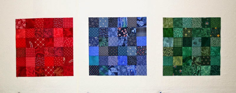
I don't remember how I got started on this, I was just fooling around in the sewing room one day, but I made a navy blue block from my pre-cut 2 1/2" squares. I named it sapphire.
I loved the way it seemed to shine. So I made another one. I named it Ruby.
One block lead to another. Most of the pieces were cut, it was just a matter of going through the collection of pre-cut squares and matching shade and value, varying pattern and theme.
Emerald.
I didn't have a plan, I was just enjoying the color, so intense, so stimulating. I made more.
Amethyst.
Topaz. This one took a little more effort, going through the yellow/gold fabrics and digging deep into the scrap box.
Aquamarine. It was amazing how closely valued squares appeared different depending on where they were in the layout, or how the block looked in morning light, room lighting or in the semi-dark. Each block became a study in subtlety.
Well now I had six, maybe I better create a plan. How about a 3 x 3 layout, set with lattice? What color should I do next? It might work if I balance the cool colors with an orange, or pink. But if this quilt was going to be called "Jewels" are there orange gems? This quilt was leading the decision making, not me.
Tourmaline.
I wanted a cool color next, so I auditioned Jade. Nope. In my entire fabric collection, this was all I could come up with in the same shade.
How about a lime green block? Not possible either.
Here's the layout at this point.
How about black for Onyx? Nice idea... didn't look good at all, like a black hole, no shine. I needed another warm color. I auditioned yellow. So far the fabrics in the blocks had only repeated 1-2 times. With a limited collection of yellows in the same hue, I repeated fabrics 2-3 times. It looked okay.
Citrine.
I put them on the design wall and they suggested a warm, cool, warm row alternating with a cool, warm, cool row. That told me the last block should be orange.
Spessartite.
44" x 44" at this point. It's still talking to me.
Gem names and colors can be seen here.
Subscribe to:
Comments (Atom)


